

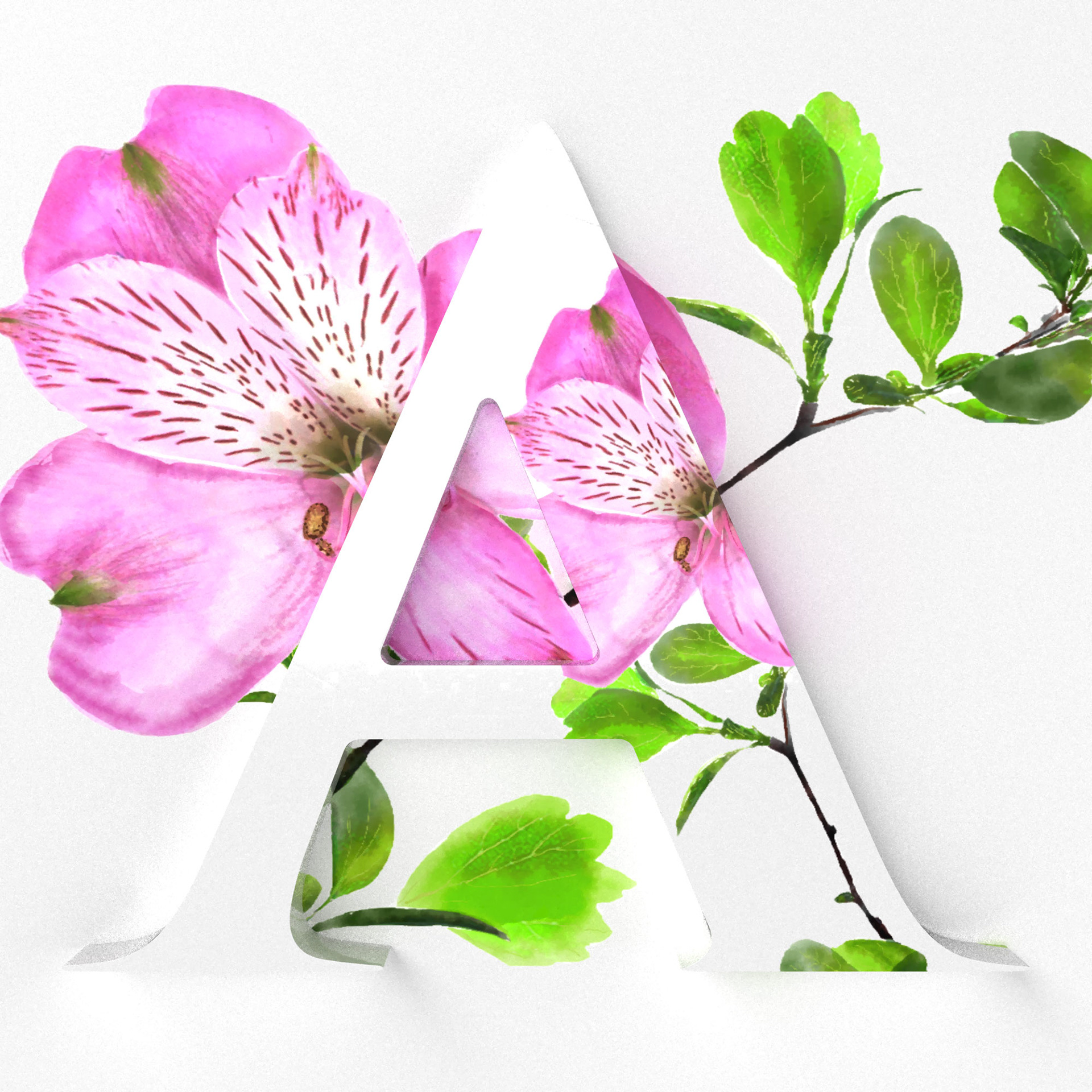
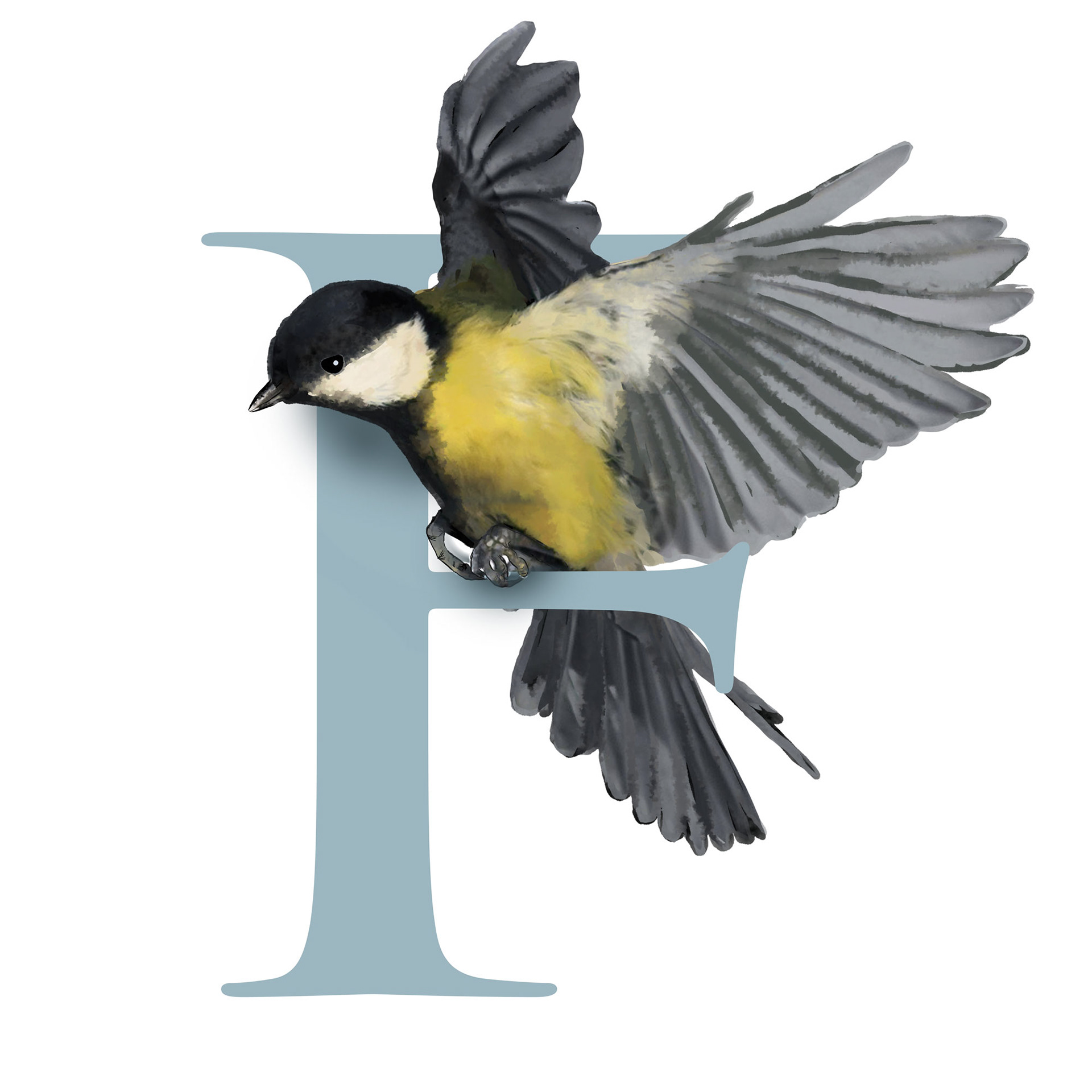
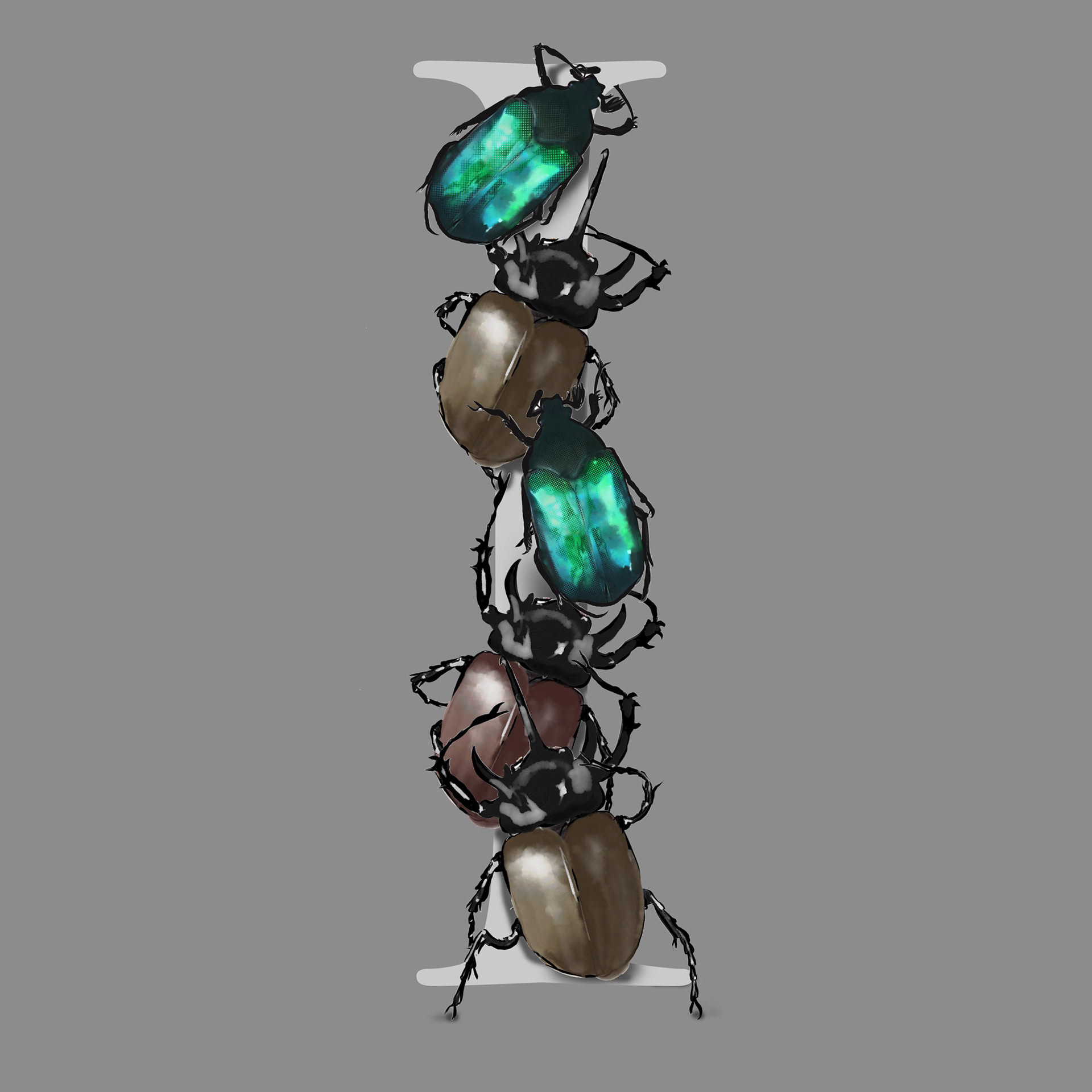
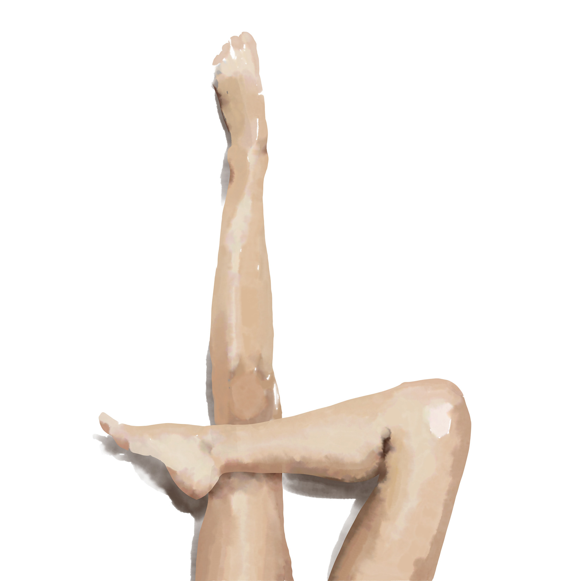
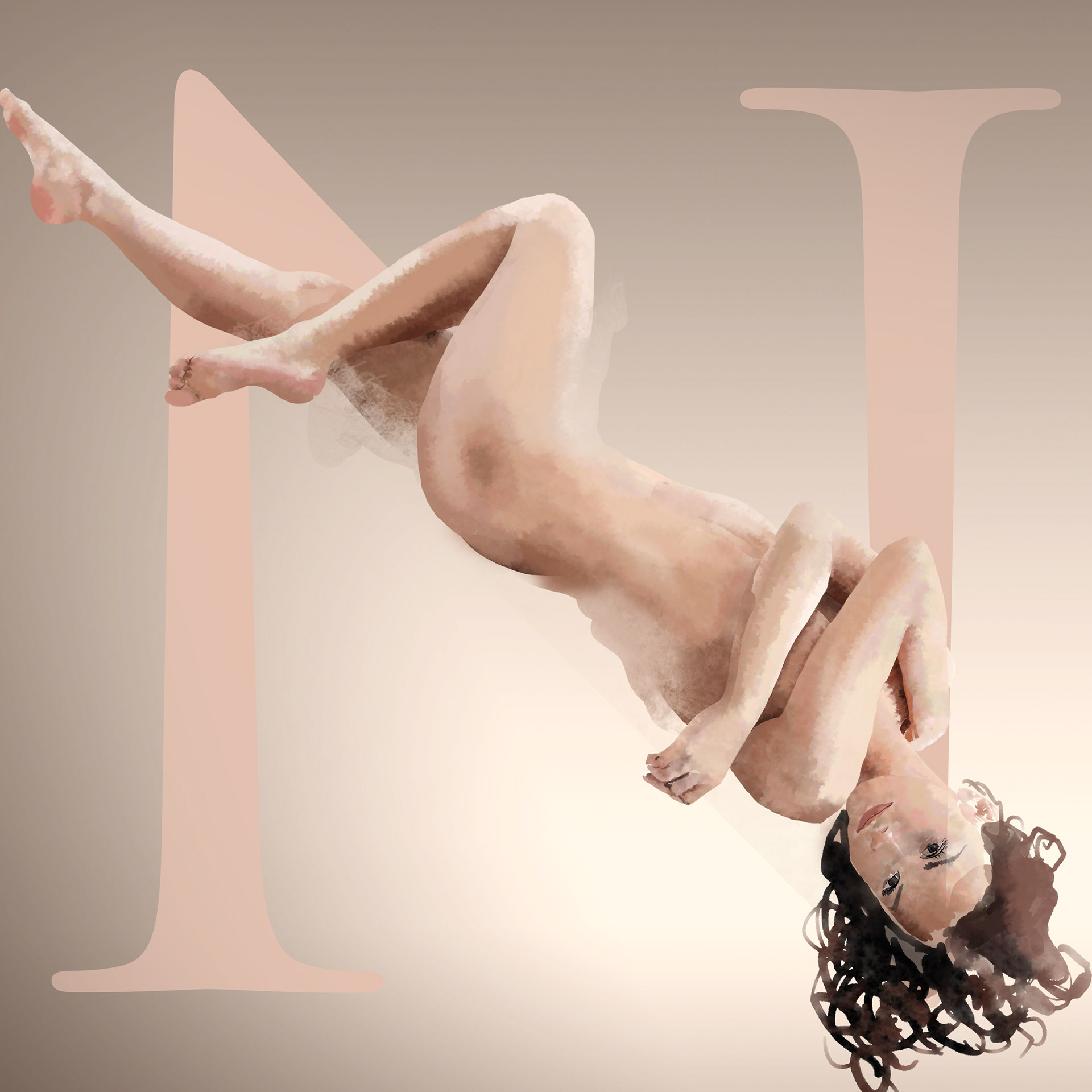
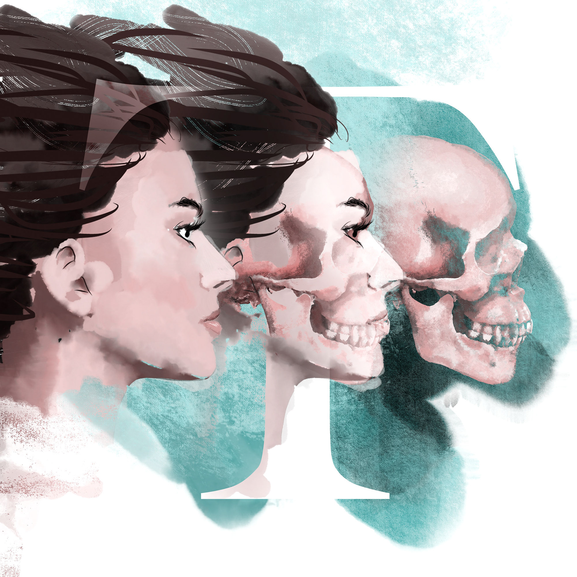
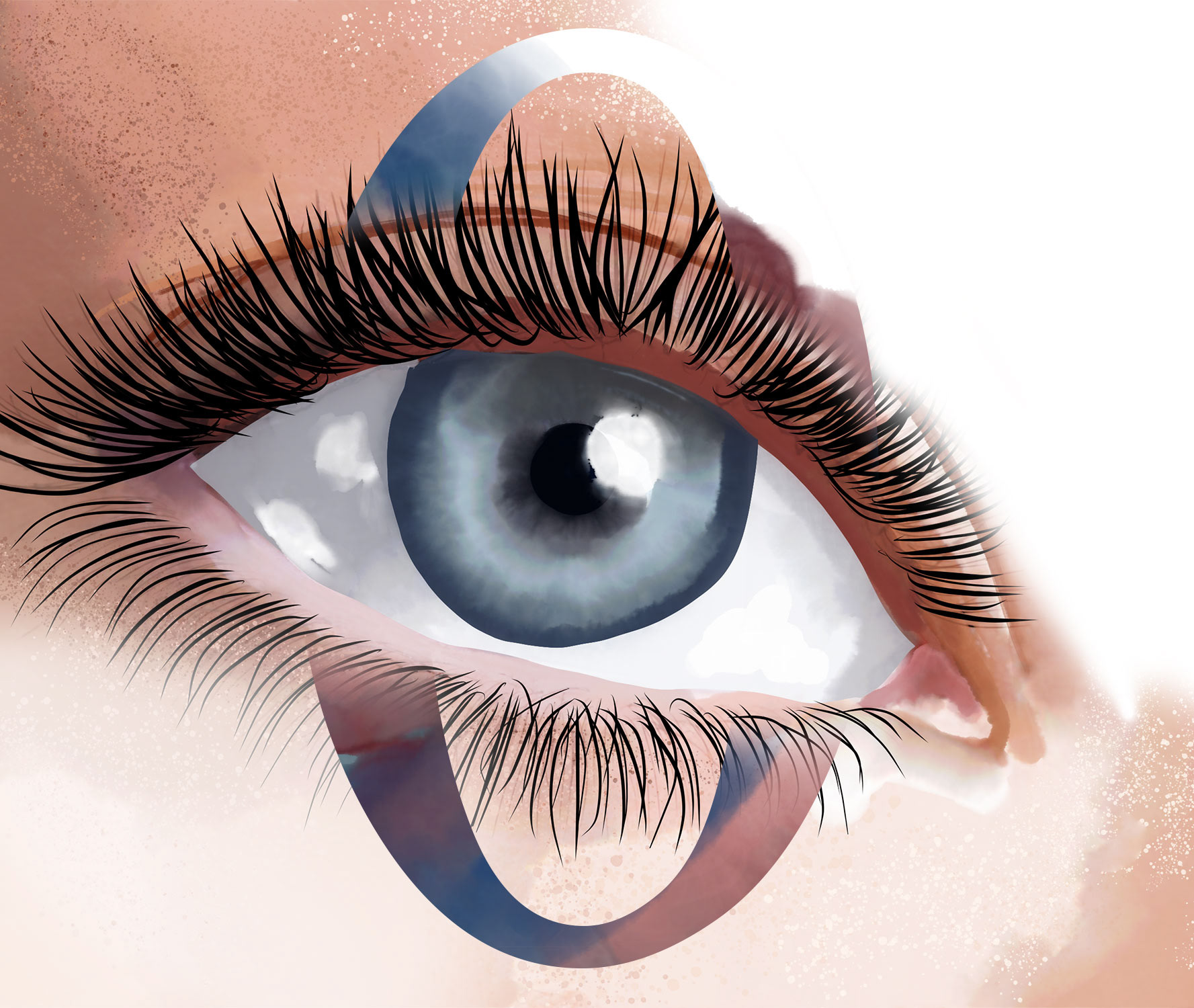
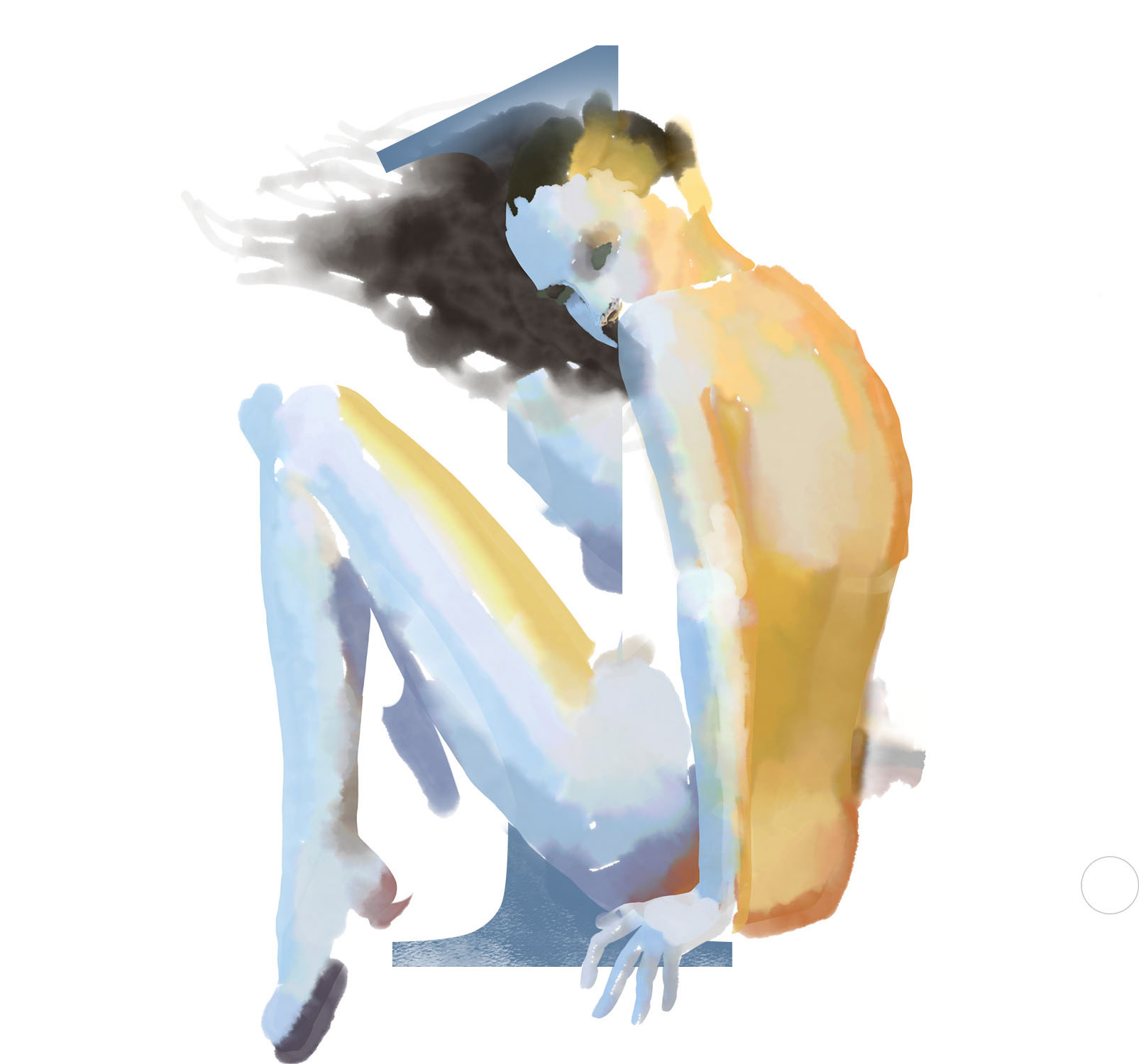
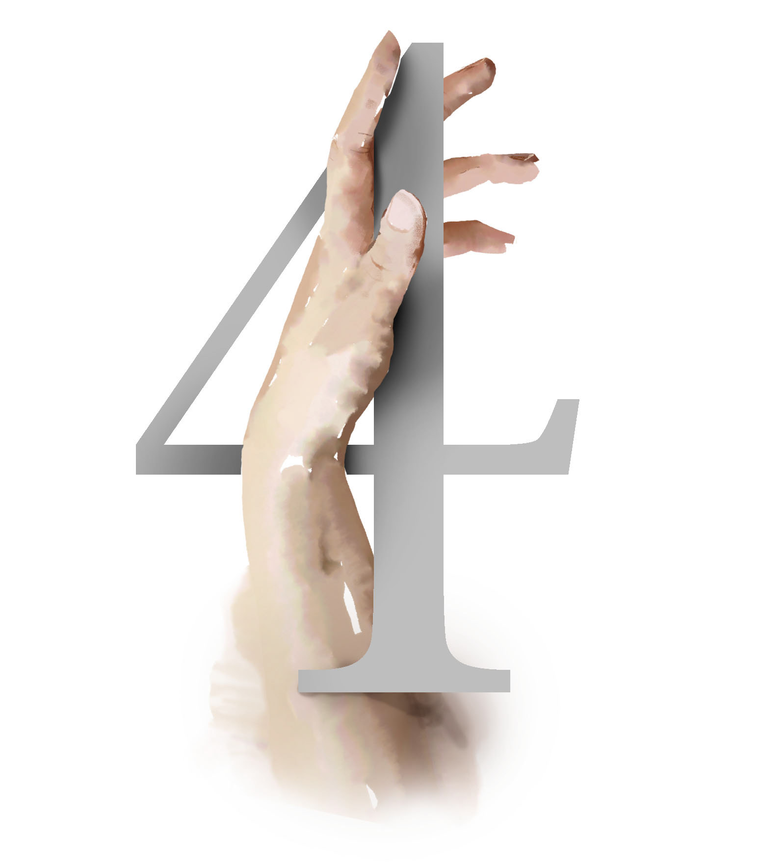
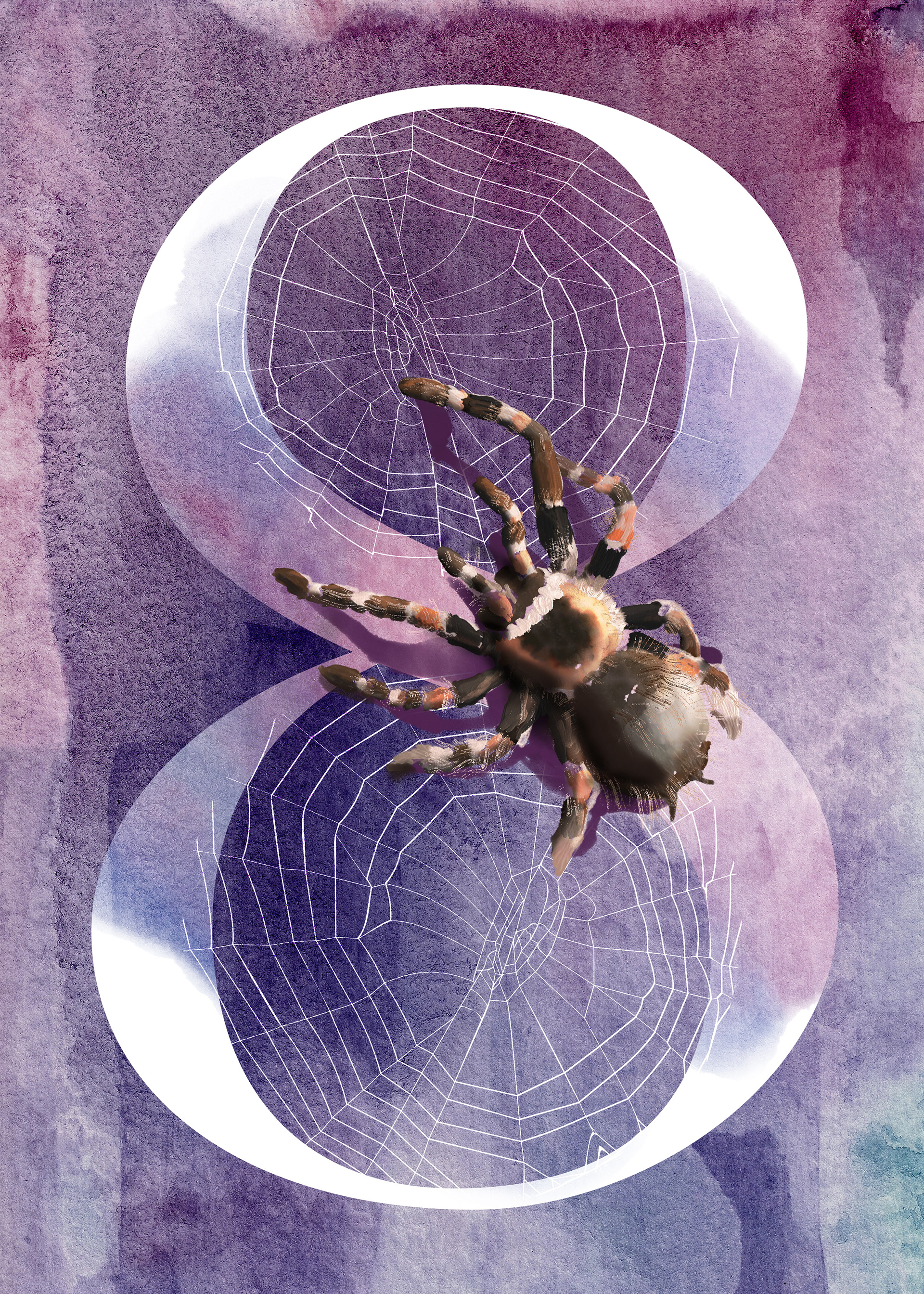
Participated in a project called 36 Days of Type. Started on April 2 and concluded on May 8th. For those 36 days artists, designers, and hobbyists are encouraged to put their own creative take on one letterform a day and share it with the world. Below are my results (which are also posted on Instagram).
What I mostly used was painting using Project Gemini and compositing using Photoshop. (I also started compositing using a prerelease of Photoshop for the iPad, coming soon.)
What I've Learned
My goal for the 36 days was to get back to my illustrator roots, and to test out these two new apps from Adobe. Looking back there are some things I'd do differently I thought I'd post what I've learned:
1. Be consistent with the font and the canvas size. (Started square, ended as a rectangle)
2. Plan your days. (I got behind due to poor planning)
3. Giver yourself a deadline for brainstorming. (Sometimes I'd spend way too much time thinking of the perfect thing to illustrate)
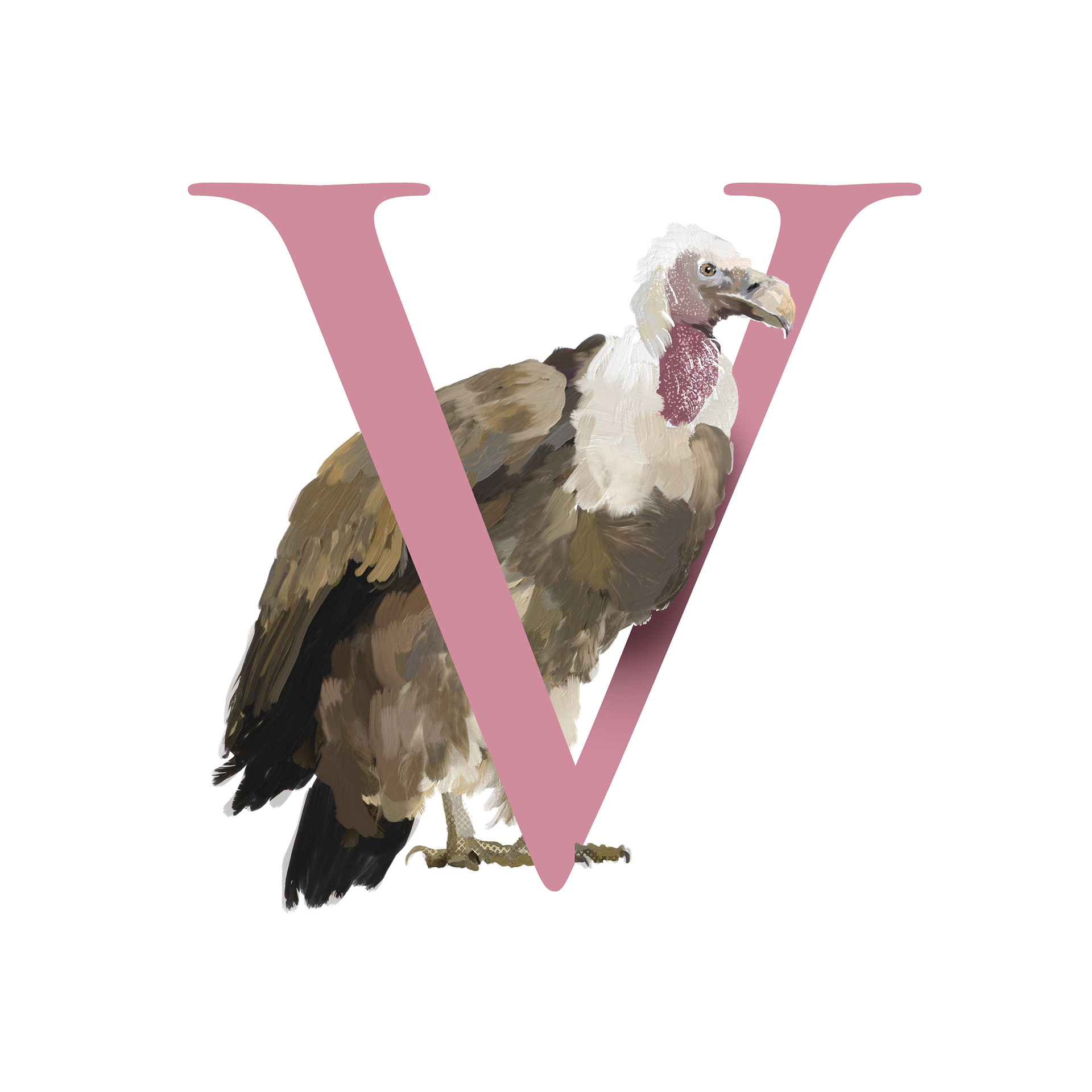
4. Effects don't make good artwork. (Just look at P below)
5. Simpler is better. (my favorite is #4)
6. Perfectionism is the enemy of progress.


Below are some video recordings from Project Gemini.
Lastly, there were results that didn't end up in this project but hopefully I'll find a use for them.

Thank you for viewing!